Getting bang for your buck: a tale of health care systems in two graphs
August 3, 2011
In the recently released OECD Health Data 2011 study, a comprehensive analysis of health statistics among OECD member nations is presented. Here are two graphs that summarize one of the greatest problems the US faces when it comes to health care: what are we getting for our money?
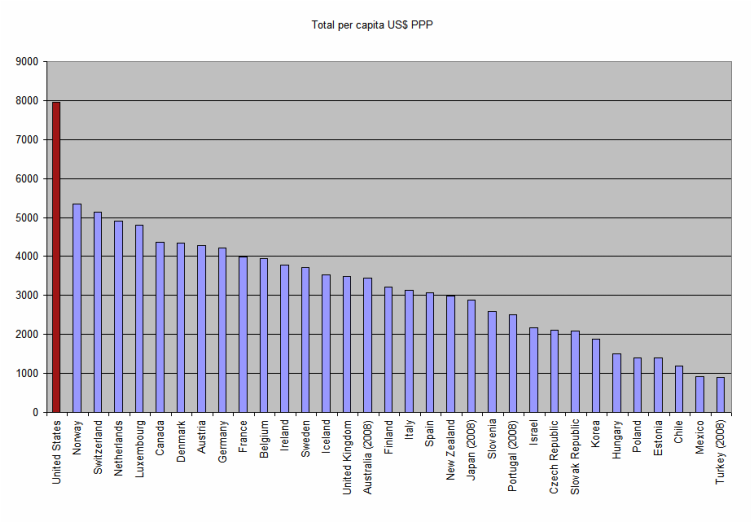
Graph 1 shows total health expenditures (public + private) per capita, PPP adjusted in US$.
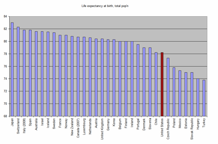
Graph 2 shows mean life expectancy at birth for total population (male vs female).
The United States -- the only nation listed without a universal health care system -- is in red in both graphs.
In the recently released OECD Health Data 2011 study, a comprehensive analysis of health statistics among OECD member nations is presented. Here are two graphs that summarize one of the greatest problems the US faces when it comes to health care: what are we getting for our money?
Graph 1 shows total health expenditures (public + private) per capita, PPP adjusted in US$.
Graph 2 shows mean life expectancy at birth for total population (male vs female).
The United States -- the only nation listed without a universal health care system -- is in red in both graphs.
If you were considering sending your child to a college over half again as expensive as Harvard, only to find out it placed in the bottom quartile of performance (e.g. job placement, law school entrance exam scores, etc), wouldn't you reconsider?
So why is the equivalent accepted for an entire nation's health care system?
